Wednesday, April 10, 2024

Project Components

 Here is the link to the trailer 

https://drive.google.com/file/d/1x7Ufcn9sVG0rKMh35ukAeGJ8S4gO94JP/view?usp=sharing

Tada

Instagram Link: 

https://www.instagram.com/alettertomymomfilm/?next=%2F

The folder with everything incase it doesn't work 

https://drive.google.com/drive/folders/19Ts91vDdX_sfHSmw9rW6oElKj0QcYMkS?usp=sharing


Tuesday, April 9, 2024

CR

 So for this project we had our ups and downs but ultimately I think we did good with what we made. When thinking of the concept we wanted to spread awareness on an issue that specifically targets our audience. We chose depression as it's become a very prominent issue for youth nowadays and we wanted to do something that would have an impact on our audience and to bring awareness. The premise of the "film" would be that the story or our character would be narrated from the perspective of their suicide note. We went the route that at the end of the “film” the main character who struggles through the majority of the film, ends up taking their own life, through the film it shows how you wouldn't always tell what someone is going through. We wanted the audience to feel what the main character is going through and connect with them. to emphasize that we ended up hinting at the two characters having feelings for each other which makes the closeness that much more devastating. We wanted the audience to feel everything that the characters were feeling so in our shots we tried to get as intimate as we could without it being weird. Everyone's lost someone so we all understand that feeling of grief and the struggles with it but others struggle more than some so we wanted to bring awareness to the suffering of grief and the depression. We chose the story to be narrated through the perspective of the characters suicide note because it's showing the story of their life. before they chose to make this choice. Almost like a “they missed all the signs and this is what happened to me”. just to slightly alarm everyone to take more of an action towards the issue.


The title “A letter to my mom” was meant to kind of act as a part of a suicide note. The idea initially was to have the mom be the one who passed away but we instead went with a close friend passing and having the character be close to her mother hence writing the suicide note to her mom. In the note she would be exposing her thoughts and thought process to her mom which would end up being the narration through the film. In the trailer the beginnings of her note are read out to have an ominous feeling and then jumps to a happy song showing a happy life which is meant to create a sense of how quickly life changes for the main character. We want to emphasize the drastic changes in our characters' lives to show how quickly things change and the toll that depression has on an individual. We really tried to stick close to the letter when posting and in our thumbnails. For example the movie is more sad so the color tones would be super cold and like blue or muted colors. But also some warm but stale colors. Not too saturated but more muted and leaning towards a lower contrast. But we wanted to start the trailers warmer or more saturated to show that everything is great and have the end be colder. Also, a lot of teenage movie trailers show a lot of interaction between a few characters: a trusted adult, a friend group, and parents are the common ones I found. Given that our film is centered around teenage suicide we decided to show how they interact with their friends rather than their parents. We all trust our parents but telling them something so upsetting and sad is not something we want to do. 


Our products engage with the audience by showing the intimacy between the characters in our thumbnails and our poster. the colors, the photos and the title including all of that leads to suspense which makes it engaging to our audience. I used reference posters from “Drama girl” and “Never let me go'' to help give me an idea on how to execute the posters. Not revealing too much but engaging enough to pull our audience in. with fewer words on our posters the more the audience would be drawn into the image itself and therefore more curious as to what the production is about. I also looked at the thumbnails for 13 reasons why as the concept of our film is similar and it included both main characters in the poster. Since we are doing a limited theatrical release the poster sales would be limited as well so they could only be given out at certain times. Same with how the sales of a popcorn bucket would go. The demand for them would be up so the sales would increase. On our social media we've posted many little things to engage our audience. We have a post of the two characters hanging out in black and white saying “friendships are a powerful thing”...EXCITINGGGG. We really don't want to make the film seem super happy, go lucky, we want to make sure we add that detail of being ominous so everything we do or post is very much half and half. 


Our products don't challenge conventions too much but normally streaming platforms don't show the thumbnails to their newer films prior to its release like how it'd be shown on the platform which we did. A Marketing tool I learned was to BOMBARD THE AUDIENCE. a lot of big-name companies just bombard their audience to get them intrigued. Also we did the behind the scenes videos and all before the release of the film which is usually done after the gold release to gain more traction. But the concept of our film definitely challenges conventions. Given that we intend to basically kill off the main character, it's not a common thing done in the industry because you can't have a story without the main character acting. The only way most people would execute something like this would be to have the characters story told by someone else and we wanted to get up close and personal. 


Friday, April 5, 2024

the plot thickens

 so i'm in the process of editing my trailer im just missing a few shots and then i should be good. 

older picture of when i was going through footage 

Old picture of when I started 


But I've basically finished the streaming thumbnail and I think it looks awesome. 


I used Photoshop because it was just so much easier to edit the picture on. 

i also used the sunset picture because it looked more professional and intriguing like an actual thumbnail. 

Wednesday, April 3, 2024

yapparama


So we met up again in groups and it was like a little update for everyone. 

A lot of people had trouble being consistent with their blogs, that was something we all had in common. 

But the one issue I wanted to get help on was the key art we should use for our streaming thumbnail. as said in my previous blog. 
So I showed all my options to my little team and they liked the ones where they were more intimate so it dumbs it down to 2 
we also just discussed where everyone is, we've all basically filmed everything so it's now just post-production and beginning our CRs

Tuesday, April 2, 2024

Streamin

Ok so I've been going back and forth with the different key art ideas. I'm definitely using pictures of our actors but i just don't know which to choose 


Friday, March 29, 2024

trailers

 So luisa and i had previously decided to each edit a trailer for our portfolio project. 

It's required that we need two trailers so i edit one and luisa edits one. 

My structure is more story based whereas luisa's is more action based. 

Structure: 

Beginning- 

• everything is fine

   - school shots, fun shots with jackson 

• transition with the car shot sitting outside

• accident

•depression

   -writing shots, lying in bed sad, etc etc

•then an ominous end 

title sequence 


I like doing story based given that it's more chronological in which things happen. There will also be VOs to help push the sequence forward. 

Wednesday, March 27, 2024

Future filming‼️

 Okay so since we got most of our shots between the two characters done previously, we wanted to get shots of lynda interacting with others like socially to show a semblance of how life was before the accident and then we show those similar interactions after the accident to further emphasize how much it's impacted her. 

We planned to film those social scenes during school or at least around school since that's a big social area for teenagers. So that'll have to wait until school starts again !

Monday, March 25, 2024

Filming Day 1:

 FILMINGGGG

We actually found some time to film most of our shots 

So we planned to film on Friday but it started down pouring so we couldn't film anything so we just filmed on Saturday. 

I showed up at Luisa's house and we sat and planned where and what we would film before picking up Lynda and Samuel. We initially planned to film just Lynda on Saturday but Luisa felt it better to film it all that day.


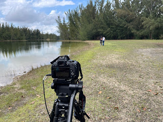
We started off our filming at Markham Park given that it's got a lot of grassy areas and it's like a big open space so we wanted to show their closeness in open spaces if that makes sense. We also filmed the accident scene there, which by the way was terrifying. Sam had to drive my car FOR THE SAKE OF FILM and oh my goodness was it horrifying. 


We got the majority of our shots at Markham and then we went back to Luisa's house to get some shots of just Lynda alone and her writing the letter to her mom, which Sam made impossible because he could not be quiet for the life of him while filming. Then we filmed some shots outside of her house for symbolism and cool trick shots. 


The last of our shots were filmed at Vista View Park during the sunset. We ended up hinting at the two characters having feelings for each other which makes the closeness that much more devastating. we wanted the audience to feel everything that the characters were feeling so in our shots we tried to get as intimate as we could without it being weird. 

Friday, March 22, 2024

Meet the Cast!!


Both actors are mutual friends of mine and Luisa. 

Lynda who is playing Liz 


and Samuel who plays Liz's Friend Jackson who dies 


We managed to film the majority of our shots but ill go into further deatil in my next post 

Tuesday, March 19, 2024

research for trailers

 so i did some research on movie trailers specifically ones for teenage drama and here are some of my pointers 

- showing how the MC is "different": given that our character will be considered somewhat of a loner by the end of our film we need to show in the trailer the deterioration of the character. But if we were to have the character be aloof in a sense, we'd have to emphasize what about our character that makes them stand out from other people

- depending on the genre the coloring matches: if the movie is more thriller or sad the color tones would be super cold and like blue or muted colors which I think would fit our characters and the film better. But if we wanted to start the trailers warmer to show that everything is great and okay we could do that and have the end be colder. the trailers could just grow colder as it goes on. 

- interactions between 2 characters: a lot of teenage movie trailers show a lot of interaction between a few characters: a trusted adult, a friend group, and parents are the common ones i found. Given that ourI film is centered around teenage suicide we would have more interactions between the parents and the friend group. 

- narration?: Narration is optional, you could either have it throughout the whole trailer or only have it for a part of it or none of it. I think we should play around with both I'm leaning more toward having it in the end and not having it in the beginning 

- focus on what makes the MC different: this one goes with the previous one but it's more geared to lock in/focus in on what makes the MC different. use it to our advantage. 

- the climax is short but not too revealing: pretty self-explanatory, but the actual climax itself should be suspenseful so you can't reveal too much. you do have to play on it though so after the climax it should be clear what the problem is but not too much


Monday, March 18, 2024

well.

 okay so, I'm doing horribly with these posts. I planned to do them on my trip but we ended up having no wifi in our hotel. so that's great. 

although I did learn a few things during my competition. 

i learned different ways to market a film that would work for our portfolio project.  

Marketing tool. BOMBARD THE AUDIENCE, I learned while doing a tour at paramount studios that a lot of big-name companies just bombard their audience to get them intrigued. they also list their big-name actors before the movie so that people get excited to see their favorite actors in the movie. 

so what im thinking we do for our social media is to get our actors rounded up and post them as it were a big film so we can get our audience excited. 

Project Components

 Here is the link to the trailer  https://drive.google.com/file/d/1x7Ufcn9sVG0rKMh35ukAeGJ8S4gO94JP/view?usp=sharing Tada Instagram Link:  h...